Design System Examples From Three Real Projects
Three projects ran the same five-question design system interview and ended up with three systems that have nothing visually in common. That is the point of the exercise, and it is easier to show than to argue.
Each design system is a single self-contained HTML file living in the project’s own repository at .code_my_spec/design/design_system.html. It documents the choices and renders them live at the same time, so the swatches below are the real thing rather than a picture of a specification.
MetricFlow: dark, alive, analytical
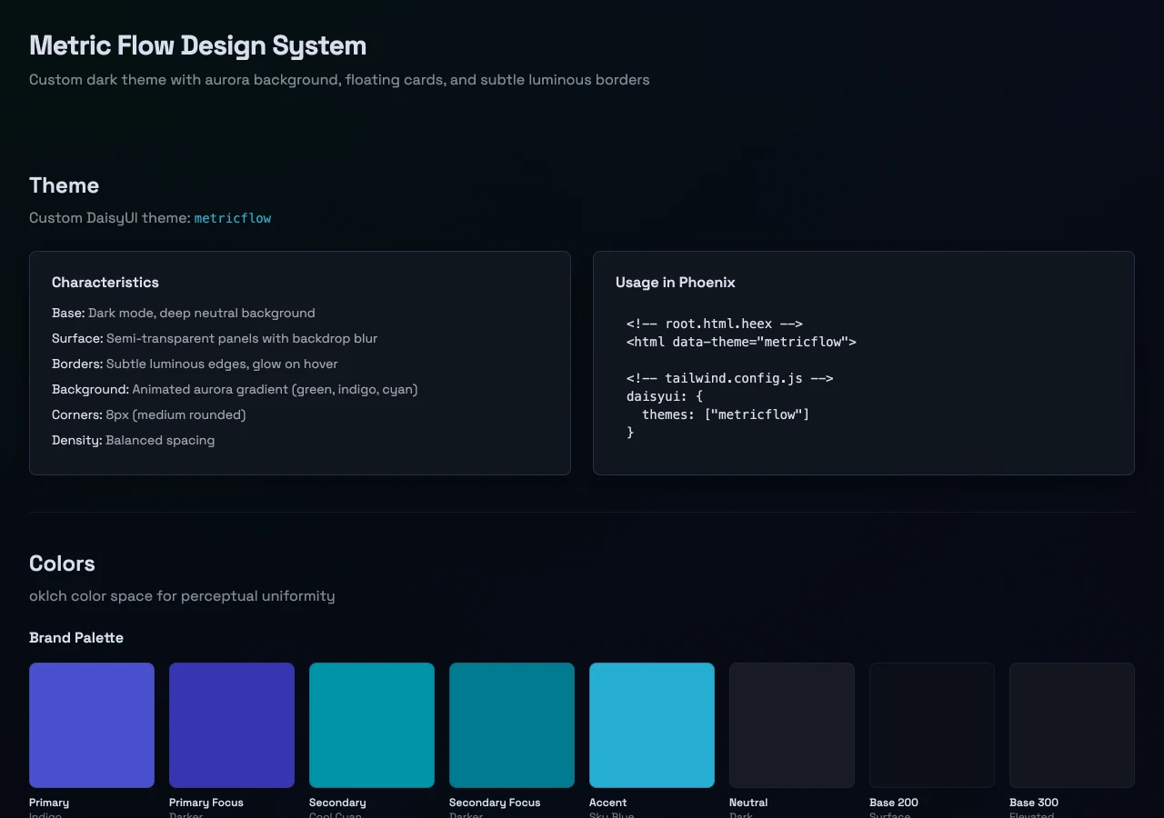
MetricFlow is an analytics product, and it wanted to feel alive. The answers went custom rather than picking a named theme: a bespoke metricflow theme, a deep neutral ground, semi-transparent panels with backdrop blur, and an animated aurora gradient behind the content. Primary indigo, secondary cyan, accent sky blue, all specified in oklch for perceptual uniformity.
The characteristics section reads: subtle luminous borders that glow on hover, 8px corners, balanced spacing. None of that is decoration for its own sake. A dashboard someone stares at for an hour needs depth cues and it needs the numbers to sit forward.
Keel: light, quiet, built for long sessions
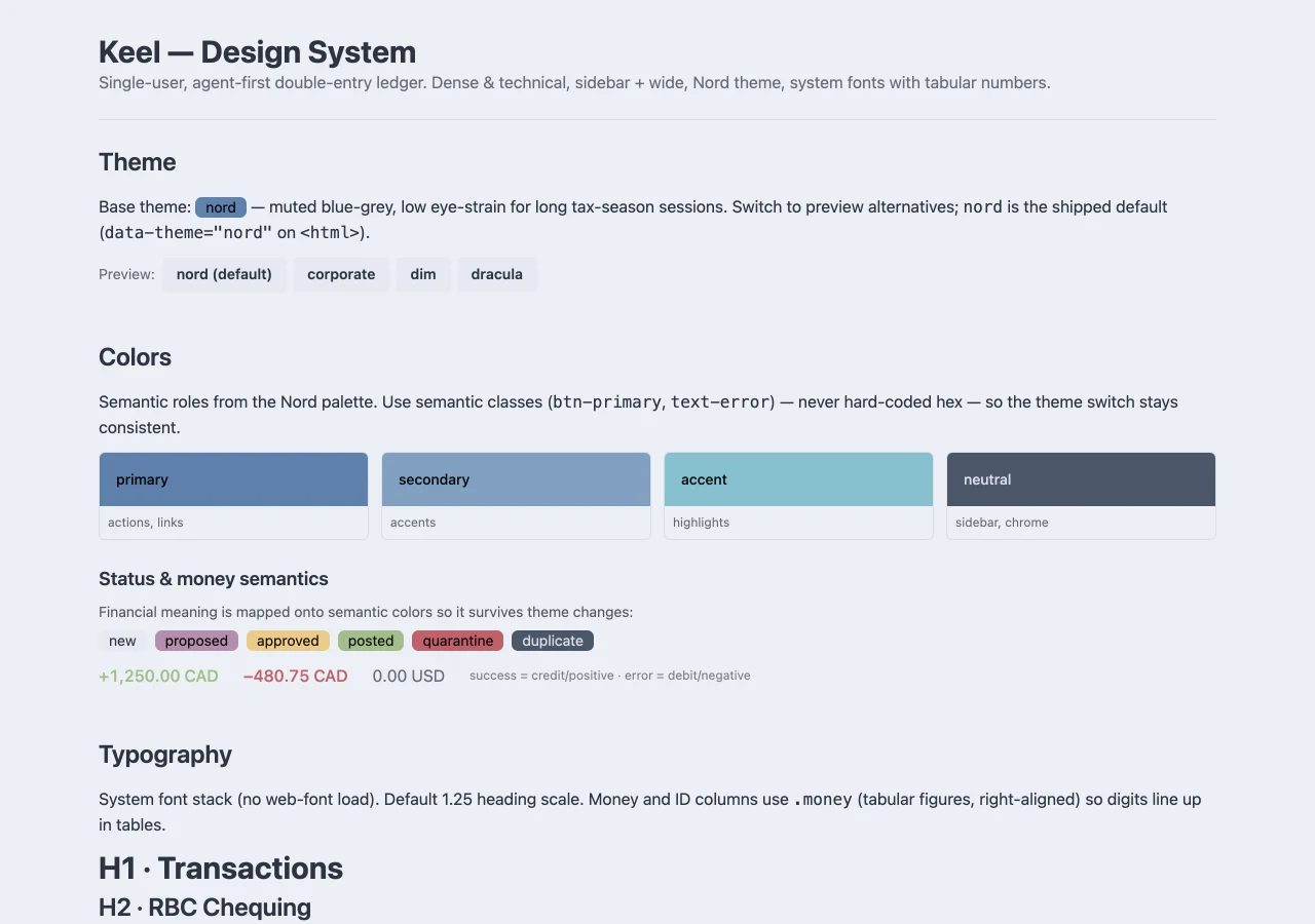
Keel is a double-entry ledger. Its design system opens with a sentence that explains every subsequent choice: the base theme is nord, muted blue-grey, chosen for low eye-strain during long tax-season sessions.
Everything follows from that. System fonts with no web-font load. Tabular figures on money and ID columns so digits line up in tables. And financial meaning mapped onto semantic colors, so success reads as credit and error reads as debit, which survives a theme change because nothing is hard-coded to a hex value.
That last decision is the one worth stealing. Assigning colors to roles in your product rather than picking values you like is what lets a palette survive features you have not thought of yet.
Get AI Traffic: a third answer

A different product, different answers again.
What the three prove
Put MetricFlow and Keel side by side and the argument makes itself. Same interview, same five questions, and the results share no palette, no density, no type treatment, and no mood.
The subtler thing they prove is what did not happen: none of them look like CodeMySpec. The process does not impose a house style. It makes you decide, writes the decision down, and then holds every page you build afterward to it.
That is the whole difference between a site that looks decided and a site that looks like every other vibe coded website. The tool was never going to pick for you. It was always going to reach for the average until somebody chose.
Ready to make the five decisions for your own project? That is the design system step.